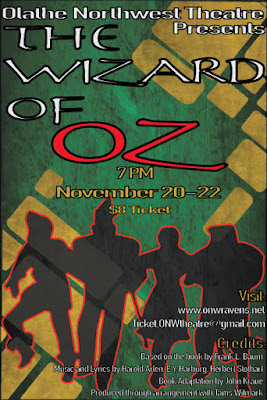
OZ poster-CARP
CONTRAST
The first letter in our acronym is C representing contrast. My poster used contrast in many ways, from the fill color against the stroke color, to the typeface between sections. My first step in creating this poster layout was deciding what words/phrases were most important and needed to stand out. I thought the most important part was the title obviously, but beyond that I thought the word 'OZ' was the most important word in the title. That is why i made the last word of the title a more contrasting color to the background, and I made the font size bigger than the rest of the title. Then I decided that the time and date were second important, and made that a different color to show that it was a new section of the poster.
ALIGNMENT
The second letter of our acronym is A representing alignment. My poster used alignment by centering some things, and left or right aligning others. I started thinking about alignment of things once I was mostly done composing my poster, so I could see the whole picture and what would look best. I started at the top, left aligning the first part of the title, then centering what i thought was the most important word-OZ. I also centered the time, date, and ticket cost below that. Then at the very bottom, I right aligned the school website, where to buy tickets, and credits.
REPETITION
The third letter of our acronym is R, representing repetition. The most obvious place that I used repetition on my poster is at the bottom, with the heading of the credits and where to buy tickets.
I also used repetition in the section with the time, date, and ticket price. In this section I used repetition in the fill and stroke color, along with repetition of typeface throughout the entire poster.
PROXIMITY
The fourth and final letter of our acronym is P representing proximity. I used proximity at the bottom of my poster separating the visit sites and the credits. I placed the individual websites fairly close together, followed by a clear gap before the credits. I also focused o proximity for the title. I made the first section of the title in the same alignment, same color, and same typeface. Then I separated the last word-OZ-because I found that to be the most important word and placed it in the negative space in the yellow brick road.

Comments
Post a Comment